We’ve created a new identity for Designworks to coincide with the move to The Mintworks.
The identity, along with the website, has been simplified.
The logotype is contained in a square and uses the company name with a full stop.
We decided to use a square because it represents support, reliability and structure – all of which closely align with our business. Like the identity, a square is simple – it features four sides of the same length and four corners of the same angle.
We included a full stop, after the business name, because it’s part of everything we do. Without the full stop, there would be no structured sentence, HTML code or website domain. The full stop, like our company, is small but plays an important role in web development and communication.
The website’s minimalist design, lack of conflicting visuals and mobile navigation simplifies the layout and makes the messaging clearer. Our Services and Portfolio are key areas and attention is drawn to them with pulsating buttons and use of the brand colour. Clients are encouraged to stay on the site throughout their journey. The web portfolio pages contain embedded websites so the user can view the portfolio item without leaving the page.
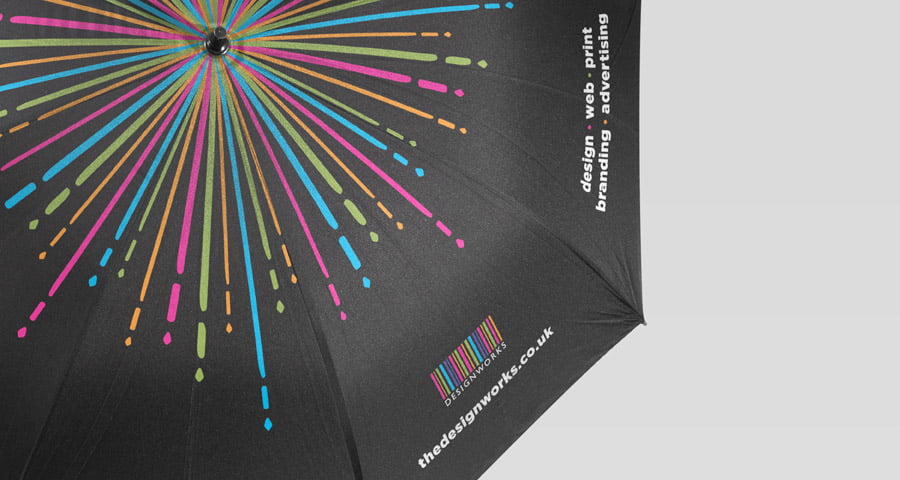
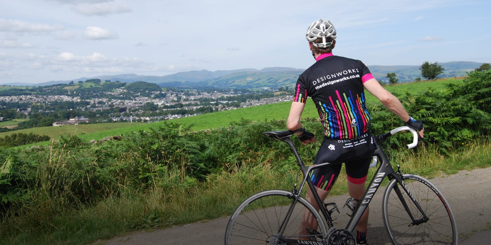
The previous multi-coloured barcode style logo was created fourteen years ago and has been used to brand a range of material including cycling kit and umbrellas.